Wednesday, September 26, 2012
Wednesday, October 05, 2011
Colour Trends
My favourite menswear trends for Autumn Winter 12/13.
I like this colour direction. I think the colour tones are warm and I like the oranges. I think pops of orange would look great against dark suiting. The bright colours could also be used for accessory ranges and trims.


Cut it Out
I first saw the work of Noma Bar in the Oberver. I liked his strong simple images. I attended the London Design Festival 2011 and realising that Bar had an exhibition I went along.
I think Bar's work is very humorous, clever and simple. At first glance, these graphic images he creates are bold and brightly coloured yet within his work often lies important political and social messages.


Images from: http://grainedit.com/2010/03/17/noma-bar-interview/ and http://www.dutchuncle.co.uk/illustrators/noma-bar/portfolios/portfolio
London Design Festival
This is one of my favourite images from my research, it shows Textile Field; an installation linked to the London Design Festival 2011.
The Raphael Court was built specifically to house the seven Raphael Cartoons by Italian Renaissance painter Raphael. The gallery was built specifically to house the seven Raphael Cartoons by Italian Renaissance painter Raphael. The gallery was built in 1865 when Raphael's reputation as the greatest painter of all time was at its peak.

The gallery has the quality of a church. I love the juxtaposition of this thoroughly contemporary installation in a room that celebrates the work of a Renaissance painter. Textile field takes over 240 square metres of the gallery floor with gentle undulations of soft fabric, creating an expansive textile lounge that invites visitors to spend time relaxing in front of the artworks in a mush less formal setting than usual.
Tuesday, October 04, 2011
Show Your Stripes
I wasn’t sure what to expect from Dublin Contemporary 2011, being unsure as to what exactly contemporary art is! The exhibition theme didn’t exactly invoke optimism either, not surprising give the title; Terrible Beauty—Art, Crisis, Change & The Office of Non-Compliance, taken from William Butler Yeats’ famous poem “Easter, 1916”.
Yet, forsaking the theme, amongst the weird and wonderful, and downright bizarre was also the cool! I was fascinated by an installation called Studio 1: Plus/Minus by Anne Cleary and Denis Connolly a duo who produce video installations and experimental films. Like so much of the exhibition; where the prevalent colour scheme throughout the artworks is shades of grey, black and white, their interactive installation is a large black and white stripy projection. Yet this is where the similarity ends, the Cleary Connolly exhibit is playful, elegant and inviting.
Plus/Minus is set up with cameras and projectors and places the visitor within the film! As visitors enter the room, the stripes are deformed and echoed by the visitors’ moving silhouettes! The projected stripes are distorted and create new patterns on the wall. The installation plays with the theme of the shifting boundary between art and life.
Monday, October 03, 2011
Infra
I first encountered the work of Irish Contemporary Art Photographer Richard Mosse at Dublin Contemporary 2011.

Images from: http://www.richardmosse.com/photography.php
General Fevrier

Men of Good Fortune
Mosse aims “to shock the viewer with this surprising bubblegum palette, and provoke questions about how we tend to see, and don’t see, this conflict.”
Images from: http://www.richardmosse.com/photography.php
"Never Out of Fashion"
“I’ve seen the future, and I’m not going.”
– David McDermott
After meeting David McDermott and taking his photograph, I didn't think of him again until I posted his picture to my blog. So I decided to do some research and see if anyone else in Dublin had noticed him and taken the time to document his eccentric style. What I found astonished and delighted me!...David McDermott is a Surrealit artist of worldwide renown along with Peter McGough!

McDermott & McGough are contemporary artists known for their work in painting, photography, sculpture and film. They currently split their time between Dublin and New York City. They are best known for using alternative historical processes in their photography, including the techniques of cyanotype, gum bichromate, salt, tri color carbo, platinum and palladium. Among the subjects they approach are popular art and culture, religion, medicine, advertising, time, fashion and sexual behavior.
They have since become well known for their way of blending art and daily life. Their photography involves appropriating images and objects from the late 19th century to the mid 20th century, and they project an image of themselves as gentlemen, posing as erudite, impertinent characters. In this way they have chosen to immerse themselves in the period of the Victorian era at the close of the 19th century to the style of the 1930s. During the 1980s, McDermott & McGough dressed, lived, and worked as artists and “men about town,” circa 1900-1928: they wore top hats and detachable collars, and converted a townhouse on Avenue C in New York City’s East Village, which was lit only by candlelight, to its authentic mid-19th century ideal.
Street style
After spotting David McDermott on Grafton Street, Dublin, I considered his style, I liked David's individuality and his deconstructed look. I also photographed James, on holiday in Dublin from Boston.


So I began to research images of men's fashion an street style on blogs such as The Sartorialist, Facehunter and trend forecasting website WGSN. These are some of the menswear looks which caught my eye.


This is my favourite look.

 Images from:
 Surprise

Florentijn Hofman is no ordinary artist. He sees the world as a huge playground.
"The Rubber Duck knows no frontiers, it doesn't discriminate people and doesn't have a political connotation. The friendly, floating Rubber Duck has healing properties: it can relieve mondial tensions as well as define them. The rubber duck is soft, friendly and suitable for all ages!"
The Loire river in France was the starting point for Florentijn Hofman's project that ultimately became a giant rubber duck. Measuring 26 m in height and yellow in colour, its impossible to ignore.
The work of Hofman is known for integrating, intriguing and interactive installations into public space. I love the strong sense of fun and the delight in seeing something unexpected.
Images and more information on Hofam's projects: http://www.florentijnhofman.nl/dev/projects.php
Funny Face

(Real) weather balloon attached to house front.
Meeker between N. Henry and Humboldt, Brooklyn, N.Y. 2004.
Dan Witz is as an artist who does street art, gallery work and pranks. He is a master of visual pranks, he sees a joke in the mundane and ordinary. The house in the image above has a very average, boring facade, yet Dan Witz has stuck a red balloon on to it and it becomes something extraordinary. It makes you look twice, it makes you smile or laugh.
I thought it was such a fun and clever idea. To morph a house into a funny face just by attaching a balloon! It is so simple I love finding humour in the ordinary and unexpected.
Image from http://www.danwitzstreetart.com
Juxtaposed

Michael Craig-Martin is a contemporary conceptual artist and painter. He produced an installation for The IVAM (Institut Valencià d'Art Modern). The IVAM is a new building but one of their galleries, La Sala de la Muralla shows the remains of the city’s mediaeval ramparts that were built in the second half of the 14th Century. And it is in this gallery that Craig-Martin has designed his installation for, he transformed the gallery into a series of environments of lurid colour, onto which he painted his characteristic motifs of tables, chairs and stepladders and also hung paintings, reliefs and wall-mounted sculptures. I love the juxtaposition here between the 14th century stone walls and arches and the bright contemporary colours used on the walls.

Part of Craig-Martin's work includes stylised drawings of mass-produced objects: sandals, sardine cans, milk bottles. "I thought the objects we value least because they were ubiquitous were actually the most extraordinary." I like this notion of the ordinary being extraordinary and special. Perhaps this is why he has chosen to use the image of household knives against a religious shrine, to emphasise that we should celebrate the ordinary. Whatever his reasons, I like the contrast of the old religious shrine and stone walls against the bright colours and range of boldly outlined motifs.
Images from: http://www.michaelcraigmartin.co.uk/
The Clash?
I discovered the design duo Craig Redman and Karl Maier after seeing their work mentioned on the Colette Paris website, they live on opposite sides of the world but collaborate to create bold work that is filled with simple messages carried out in a thoughtful and often humorous way.
They specialize in illustration, installation, typography, as well as character, editorial and pattern design. And it was the patterns they designed that appealed to me. I first noticed a portrait they created of Kanye West.

I love the bold colours, the clash of colour and pattern. All the dots in different sizes on different colours set against stripes and blocks of solid colour. These combinations of pattern and colour shouldn't work yet I love them together. I think Kanye can be instantly recognised here.
Their work is so striking and distinctive. They have created other portrait series' in different colour palettes and different combinations of pattern.


Their work is so successful, it amazes me how these two work together so successfully on a daily basis from opposite sides of the world.
More of their work can be found at: http://www.craigandkarl.com/ and http://craigandkarl.tumblr.com/
Images from http://www.craigandkarl.com/
They specialize in illustration, installation, typography, as well as character, editorial and pattern design. And it was the patterns they designed that appealed to me. I first noticed a portrait they created of Kanye West.
Their work is so striking and distinctive. They have created other portrait series' in different colour palettes and different combinations of pattern.
Their work is so successful, it amazes me how these two work together so successfully on a daily basis from opposite sides of the world.
More of their work can be found at: http://www.craigandkarl.com/ and http://craigandkarl.tumblr.com/
Images from http://www.craigandkarl.com/
The Stripe Guy
Daniel Buren’s stripes are legendary. They have become his trademark sized consistently at 8.7cm wide. His fascination with the motif has evolved in the form of paintings, site specific installations and unauthorised public artworks, using striped awning canvasses in France, and posting striped posters around Paris including various metro stations.


Buren studies stripes, cut outs and the use of negative space, three themes which have taken my interest over the summer. I find his work very interesting, I really respect how he has studied the subject of stripes for so many years and experimented so rigorously. Even still his studies are fresh and exciting.


Images from : http://www.artnet.com/artists/daniel%2Dburen/ and http://www.danielburen.com/
Stripes
I first saw the work of Jeremy Carlisle at the annual exhibition at the Royal Hibernian Academy, Dublin. The piece I saw was a beautiful collage, a mesh of stripes on stripes, stripes interrupted by circles with stripes, stripes in opposing directions, coloured stripes on black and white stripes . I'm starting to notice stripes absolutely everywhere!

Triptyque
Image from: http://www.ciac-pa.com/fre/agenda-expos/mai-2008/periscope-psca/jeremy-carlisle
Triptyque is one of Carlisle's studies of stripes, I love the dark tones of navy, brown and purple with the contrasting splashes of colour in the stripes. A building I saw in Temple Bar, Dublin reminded me of this painting.
Triptyque is one of Carlisle's studies of stripes, I love the dark tones of navy, brown and purple with the contrasting splashes of colour in the stripes. A building I saw in Temple Bar, Dublin reminded me of this painting.

Skeuomorph!
Skeuomorph skyoo'e-morf, n (Greek skeuos vessel, tool, and morphe, shape)
A retained but no longer functional stylistic feature. This term was originally used in architecture and archaeology to refer to a feature whose origin was functional, but whose only vestige was as a decorative ornament. What a terrific word! One that I think befits my post on Pocket Squares! While on the streets of Dublin I spotted very few stylish gentlemen sporting pocket squares in their jacket breast pocket.

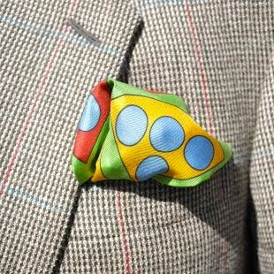
Although the pocket square no longer holds any functional connotations, I love to see a brightly coloured hanky in a man's breast pocket! I think it adds an element of fun and personality to a man's suit.


A retained but no longer functional stylistic feature. This term was originally used in architecture and archaeology to refer to a feature whose origin was functional, but whose only vestige was as a decorative ornament. What a terrific word! One that I think befits my post on Pocket Squares! While on the streets of Dublin I spotted very few stylish gentlemen sporting pocket squares in their jacket breast pocket.
In the early 1900′s, a dapper gentleman would never leave the house without a pocket square tucked neatly into his suit’s breast pocket. Yet by the latter half of that century, the pocket square began to disappear.
Although the pocket square no longer holds any functional connotations, I love to see a brightly coloured hanky in a man's breast pocket! I think it adds an element of fun and personality to a man's suit.
Images from: www.wgsn.com
Dublin Castle
 The nature of the Dublin Castle has remained, as if it was designed in the 18th century. The Castle is a remarkable piece of medieval architecture, while combining several other styles in construction. These styles include Georgian, Gothic Revival and NeoRonanesque.
 The castle quadrangle is grey and empty, the Georgian architecture is sober, yet in another courtyard tucked away in a corner is a splash of colour. Some brightly couloured buildings in green, red and yellow and blue turrets add some cheer and delight.
Drawing with Scissors
I was lucky enough to be in Dublin whilst the Matisse Art books were exhibited in the Chester Beatty Library at Dublin Castle, this was the first public display of these works in Europe. The exhibition features four of Matisse’s most artistically significant books, including the famous Jazz.
Jazz is a limited-edition book containing prints of colorful paper cut collages, accompanied by Matisse's written thoughts. Best known for his boldly coloured paintings Matisse regarded the images he created for these books as an extension of his drawing. Matisse describes his cutouts as "drawing with scissors," a process "of cutting into colour" that reminded him "of a sculptor carving into stone." He cut the shapes out freehand, saving both the item cut out and remaining scraps of paper. He would arrange and rearrange the colored cutouts until he was completely satisfied that the results.
Jazz is a limited-edition book containing prints of colorful paper cut collages, accompanied by Matisse's written thoughts. Best known for his boldly coloured paintings Matisse regarded the images he
 created for these books as an extension of his drawing. Matisse describes his cutouts as "drawing with scissors," a process "of cutting into colour" that reminded him "of a sculptor carving into stone." He cut the shapes out freehand, saving both the item cut out and remaining scraps of paper. He would arrange and rearrange the colored cutouts until he was completely satisfied that the results.
What struck me about Jazz was of course the intense, pure, luminous, colours but also the element of playfulness in the work. I liked the balance of the colours and form; I love the simplicity and boldness of the shapes and the lively multicolor forms.
I really appreciate the terms "drawing with scissors" and "cutting into color". I think these terms and the notion of working in both 2D and 3D, also describes some of the processes in fashion design. I'd like to use these terms as part of my menswear project as well as the interplay of positive and negative and the aura of playfulness in Jazz.
Images from http://www.henri-matisse.net/cut_outs.html
Yellow Mountain

Yellow Mountain
"Everything that matters on the human journey is beyond knowing. It’s a process of unknowing, of discovery, of surprise" – Patrick Hall, Drawings (2007)
On seeing this painting I instantly noticed the splash of yellow among the muted tones of the stripes. It was a surprise amonst the stripes, the first thing that sprung to mind was 'a hanky in a man's breast pocket.
Image from: http://www.greenonredgallery.com
Sunday, October 02, 2011
2D Tool box?
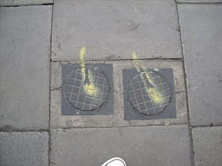 On every street in Dublin I was noticing a recurring theme, a symbol of some sort? A large scale street art project? Somebody with a lot of time on their hands? A rebrand of the city centre? I was fascinated and intrigued by these wrench icons! Why, was the question on my mind.
And I was not the only one asking this question! Several Dublin bloggers were debating the topic. I read several of their theories...one seemingly well thought out and educated guess was that an anonymous artist was making a mark and a political statement...
"a wrench connotes solidity and heft, and thus the wrench's absence forces us to feel the mass of that which is not there...It informs a self-referential dialogue between the seemingly tactile and the literally immaterial. Or there is the heavily symbolic interpretation, seeing the wrench as the symbol of the working man being trampled on by a "self-obsessed citizenry."
Quote taken from http://rosemaryhines.blogspot.com/2011/06/dublin-street-art.html
And so I did my own research and discovered that the ubiquitous, recurring pattern of a sprayed wrench silhouette was not the work of some inspired creative; but in fact the Gardai!! Yes the Irish police force have been graffitting the streets of Dublin, and the reason...a visit from the Queen Elizabeth II!
I found the icon of the simple workman's tool on the streets of Dublin fascinating and they intrigued me from the first day I saw them, I didn't expect however the wide interest and varying theories on the wrenches. And so when I found out their actual function I thought it was brilliant! The Gardai checked every single manhole, electricity box, fire hydrant in the city centre before the Queen's visit and sealed them when deemed secure. The wrench was a sign that it was signed, sealed and secured!

This was something so ordinary and quite mundane yet it intrigued people and raised questions.
Friday, September 30, 2011
Abstract
Mainie Jellett was a pioneer of the modern art movement in Ireland, she painted in the abstract Cubist style.
I first saw Jellett's work at the National Gallery of Ireland and without realising it, it was her work which influenced the direction of my entire research!

Abstract Composition
Many of her abstracts are built up from a central 'eye', in arcs of colour, held together by the rhythm of line and shape, and given depth and intensity by her use of colour. It was the simple shapes together with the dark tones against bright strips of primary colours which attracted me to her paintings.
Image from http://www.askart.com/askart/artist.aspx?artist=11042737
Subscribe to:
Comments (Atom)